Luminary (RIP)
As a lead designer on Luminary I was responsible for the end-to-end design of custom OS tablet experiences designed for seniors as well as conversational UI designs on Facebook messenger.
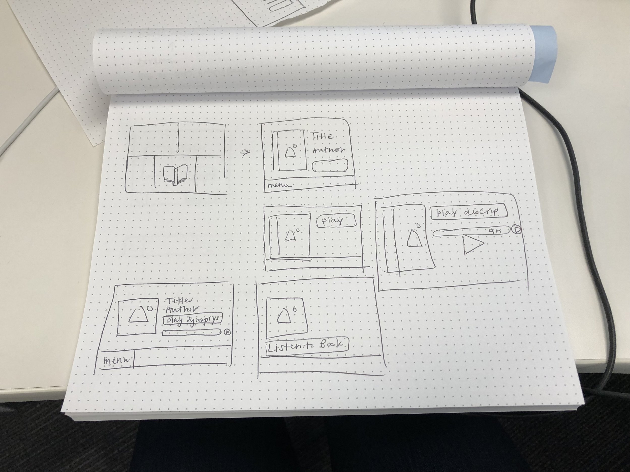
Luminary is an experience designed to connect seniors and their family members digitally. Differences in how these age groups communicate leave a gap in how they share their lives with each other. The tablet experience is designed specifically for seniors, with large buttons, loud notifications, and speech-to-text capabilities. Other features include video calls, access to take photos, and the ability to listen to audiobooks and music.
The other side of Luminary is designed for family members to send messages with a Facebook Messenger bot to increase communication with their senior. We also built an analytics platform to give family members insight into how their senior was using the tablet and to encourage other family members to interact with their senior.
Project 01 — Family Member Onboarding
2018
QUOTES FROM USERS
“I want to send him photos but I don’t understand what this messaging thing is.”
“I need help with this.”
“What’s Luminary?”
01 Situation
—
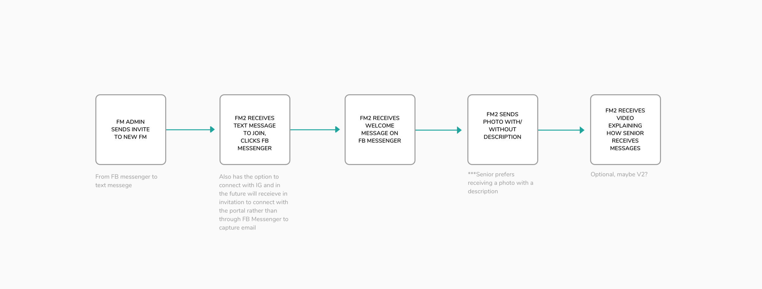
The way new family members were being invited to connect with Luminary was confusing. The family admin could invite new family members to Luminary, but the new family members would only receive a text with a link to connect to our Luminary bot on Facebook Messenger, with no explanation about what Luminary is, what the bot does or how their senior was going to receive their messages.
02 Obstacles
—
Facebook Messenger provides prebuilt templates, which makes development fast but allows for less customization. Not everyone has Facebook or uses Facebook Messenger so not everyone invited could easily connect to the Facebook Messenger bot.
03 Action
—
I first did a competitive analysis of other onboarding bots on Facebook Messenger. Some of my favorites included Poncho and Apple Music. I then created deck to outline my research and included a quick user flow diagram and wireframe to explain my ideas with my team. From there I got feedback from my peers and did a few iterations on the copy. My KPI was to increase the number of users sending a photo within the first day of connecting from 60% to 90%.
04 Results
—
When we launched the new onboarding we had an increase from 59.18% to 76.47% of users sending a photo within the first day of connecting. The next steps for this project were to follow up with our newly onboarded family members to see how their experience was and iterate based on their feedback.
What did I learn?
I learned how to brand a new product, build a custom tablet experience, and grow a pilot from 0 beta users to 50. I learned how to work in a journey team model that was KPI driven and agile. I also learned better ways to work alongside other designers on related projects, organize files and set up naming conventions. One of the biggest ways I grew during this project was learning how to build trust with my teammates to better give and receive feedback.
User flow
Wireframes


Mockup
The final scope of the project was minimized due to a week long time constraint between design and engineering.
Project 02 — Audiobooks
2018
QUOTES FROM USERS
“I think my Mom would love listening to audiobooks. She reads all the time but her eyesight is terrible.”
“I prefer reading a paperback book from my local library but I’ll give it a shot. Thanks!”